The Colors a Design System Does Not Have
- What a theme actually is here
- The half that transferred
- The half that was not there
- The slot I got wrong
- The wallpapers had no slot either
- What happened next
- What I would take from this
- Further reading
I ported the design system behind this site onto my Linux desktop, and the colors that transferred were the easy half. The interesting work was the slots that had nowhere to come from, and the one I filled wrong on the first attempt.
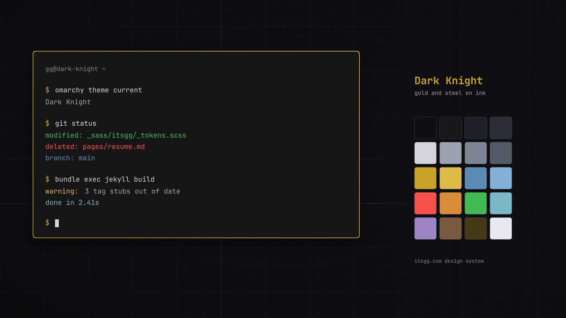
The theme as it stands now, which is not what this post describes. It was rebuilt later, and the last section says how.
The result is Dark Knight, a theme for Omarchy. It was gold and steel on ink, the same palette this site used at the time, and it installs in one command:
omarchy theme install https://github.com/itsgg/omarchy-dark-knight-theme.git
That is the news, and it is the least useful part of this post.
What a theme actually is here
Omarchy themes are a single colors.toml, twenty-six keys in the stock set. From that one file it generates nineteen application configs, among them Alacritty, Foot, Ghostty, Kitty, btop, Helix, Neovim, VS Code, Chromium, Obsidian, the Hyprland window borders, the status bar and the lock screen. You write the palette once and the desktop follows.
This site’s palette already lived in one file too, _sass/itsgg/_tokens.scss. Thirteen primitives resolved into semantic tokens, and nothing in the stylesheets referenced a raw hex. So the port looked like a mapping exercise: line up two files, done in an afternoon.
Roughly half of it was.
The half that transferred
The primitives mapped one to one. --ink-900 became the background, --paper-100 the foreground, --gold-500 the accent, --steel-500 the blue links were drawn in. Window borders got the gold ramp, --gold-500 to --gold-400, at the same forty-five degrees the site used for its accent sweep. None of those token names exist any more, which is the end of the story rather than the middle of it.
A port like this has one satisfying check at the end. Omarchy’s palette preview reports the foreground to background contrast, and it came out at 13.13:1. The tokens file documented 13.1:1 for that same pair, with a comment explaining that --paper-100 had been softened from #e6eaf0 to cut dark-mode glare. Two systems that have never met, agreeing to two decimal places, is decent evidence the mapping is faithful rather than approximately right.
The half that was not there
A terminal wants sixteen ANSI colors. The design system defined gold, steel, a success green, and an error red. That was it, because a website reading surface does not need an orange, and it certainly does not need a brown.
You have two options when a slot has no source. Borrow the missing hues from an unrelated palette, which is fast and produces a theme that looks like two themes wearing one coat. Or derive them in family: bend the warm hues toward the brass, the cool ones toward the steel, and accept that your orange is a brass shifted toward the error red rather than a real orange. I did the second. A full sixteen-color application still looked like it belonged, and the magenta was the single hue in the whole theme that sat outside the gold and steel axis, because there was no honest way to derive one.
That is the part worth generalizing. A design system is not a palette. It is a set of decisions made for one medium, and porting it means separating the decisions that transfer from the ones that were only ever about the medium.
The slot I got wrong
Omarchy has a key called muted. The design system had three levels of text: primary, secondary, and a muted gray at --slate-500. Omarchy wants four. So I derived the fourth by splitting the difference between the dimmest text color and the border color, and moved on.
Later I checked it and thought I had found a bug. The value landed at 2.76:1 against the background, below the 3:1 floor. Worse, the tokens file carries an explicit note that --text-muted was lightened from #6b7280 precisely because that value failed WCAG AA at 3.96:1. My derived color was darker than the one the design system had already rejected in writing. That looked conclusive.
It was wrong, and the thing that showed it was wrong was checking rather than reasoning. I pulled muted out of every stock dark theme that ships with Omarchy and measured each one. The median is 2.26:1. Matte Black runs it at 1.48:1. Mine was already brighter than most of them.
Then I traced where the value is actually used, which is what I should have done first. muted is ANSI color8, window borders, indent guides, tree lines, dividers, and the placeholder gray in prompts. It is a structural slot, not a text slot. Holding it to a body-text contrast ratio would have made every border in the desktop glow, to fix a problem that only exists if you assume the name means what the same word means in CSS.
The mistake was reading the key by its name and by my own system’s conventions, instead of by what consumes it. Two systems can use the same word for genuinely different jobs. The fix was not a new value, it was a note in the theme’s README telling the next person not to “correct” it.
The wallpapers had no slot either
A theme ships backgrounds, and a stylesheet has no opinion about wallpapers. Same problem, one layer up.
Rather than find images that roughly matched, I generated three from the same thirteen primitives: a steel hairline grid with gold axes, the emblem as a dark mass with a gold rim, and a ring sweep. They were flat vector, no photography, and the source is still in the repo (flat.py composes, render.sh renders), so changing a primitive and re-rendering keeps the desktop in step. That much survived the rebuild unchanged.
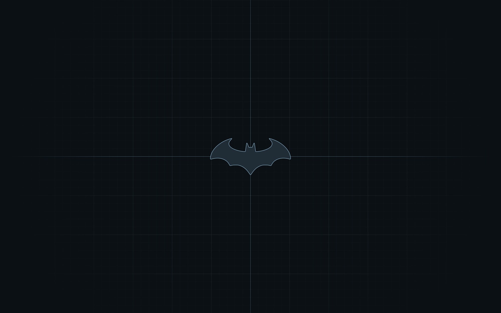
What survived: one wallpaper at 3840 by 2400, still generated from the palette. The rebuild cut the set of three down to this.
Flat was not the first answer. Atmospheric renders of cloud and city looked good in isolation and were terrible in use, which turns out to be the whole constraint: a wallpaper competes with your windows for the same attention, and it loses. Anything that reads as the subject of the screen is wrong no matter how well it is drawn. The test is whether you can still see it after a day of not noticing it.
One technical note for anyone generating dark wallpapers: at eight bits per channel a near-black gradient bands into visible rings, and the fix is a light dither after rasterizing. Doing it inside the SVG with feTurbulence does not work in librsvg, which flattens the filter into a uniform wash and shifted my background three levels off the token value. I only caught that by sampling a pixel and comparing it to the hex I expected.
What happened next
I rebuilt the theme, and the palette this post describes is gone.
The gold went first. A theme that has to derive an orange by bending brass toward red is a theme working against its own source, and the honest reading of that section, written a few months later, is that four hues were never enough to found sixteen on. The second version does not found them on the design system at all. It takes six measurements from one photograph and derives everything from those: the hue, how saturation falls as lightness rises, how colorful the most colorful thing in the frame is. Quantized to sixteen buckets that photograph is monochromatic, so the theme is too. One hue at 203 degrees, hierarchy carried by lightness alone, and a single accent placed by lightness rather than by chroma. Warm pixels are 0.07% of the image, so there is one warm mark in the whole desktop: the active workspace on the bar, because that is the one thing there you look for rather than read.
src/palette.py generates it and audits its own output against every contrast floor, and exits non-zero if one is missed. That is the part I would keep if I threw away everything else.
Then the arrow turned around. This site now takes its palette from the theme rather than the other way about, because the theme’s version had been measured and audited and the site’s had been picked by eye. The gold is gone from here too. The tokens file carries the same values with the colors.toml commit recorded beside them, so the site and the desktop are one palette in two places. I did not wire the two together. The web side needs things the script has no opinion about: a type scale, a print stylesheet that has to survive as ink on white, a raised surface for cards that a terminal never has to define. One generator serving two mediums is how both end up compromised, which is the same lesson as the rest of this post arriving from the other side. What keeps them honest instead is a check that reads the rendered pages in a browser and fails if any color on them is not in that file.
The best part is that the same slot bit me again, in the opposite direction. Porting back, muted was once more the key that needed care: the theme owed it only 3:1 on a raised surface, because there it is comments and line numbers, and at 3.91:1 on a card it was fine for that and failed as body text. This site uses muted text for post dates and the footer, which are body text and land on cards. So the web side starts one step up the ramp, at 5.80:1 on a card today, and the theme’s own value is kept for rules and marks and never used for text. The theme has since raised muted to 4.5:1 on raised surfaces too, after a reader said the dim text was hard to read on a laptop.
Same key, same misreading available in both directions, caught the same way: by tracing what consumes it instead of trusting what it is called.
What I would take from this
The port took longer than the mapping suggested, and every hour of the overshoot went into slots the source system did not have. Token discipline on the web side buys you nothing there. Those slots are the whole job.
If you try this with your own palette, the one habit worth stealing is the last one: before you set a value, find every place the target system consumes it. I assumed a key called muted meant muted text, because that is what it means in my stylesheet, and I nearly shipped a change that would have lit up every border on my desktop to fix a defect that was not there. Grep for the key, read what it feeds, then pick the number.
The second habit is newer and I am less sure of it. Both palettes here were eventually generated by a script that checks its own floors and refuses to emit a palette that misses one. Hand-picked values drifted; generated ones did not. That is one project and not evidence, but the drift was real enough that I stopped hand-picking.
Further reading
- Omarchy themes: the stock set, and what a theme is expected to ship
- basecamp/omarchy: the source, including
default/themed, the templates that turn one palette into seventeen app configs - Understanding WCAG 2.2: contrast (minimum) and non-text contrast: the 4.5:1 and 3:1 thresholds, and why the second one does not apply to a divider
- feTurbulence and librsvg: the filter, and the renderer that flattens it
- Dark Knight: the theme, with the palette and the wallpaper sources, and
palette.py, which derives the second version from the photograph and audits it - Design notes: why each value in the rebuilt palette is what it is